Showing posts with label Post-Production. Show all posts

Wednesday, 4 April 2012

Efosa: Music Video: Post-Production: Evaluation: 4) How did you use new media technologies in the research, planning, construction and evaluation stages?

4) How did you use new media technologies in the research, planning, construction and evaluation stages?


The whole project was dependent on the use of new technologies. Without search engines we would not have been able to have the necessary research to recreate a music video from The Prodigy. We had to research the genre and the demands of the record label The prodigy are signed to. This is essential because while it is within the "rock" genre, The prodigy has their own identity and we needed the adequate research to respect that. Without the use of Youtube, we would not have been able to obviously view the original Spitfire video by The Prodigy, in addition we would not be able to have Daniel spitting fire as the youtube tutorials helped us greatly. Facebook was used to communicate with eachother, when we couldn't reach one group member via phone number we would use facebook. We also held group skype sessions in which we talked over what we were going to film the next day. The use of Web 2.0s such as the aforementioned really helped us complete this project.

This shows how we used Facebook to our advantage when dealing with communicating with eachother.

Obviously Blogger was used heavily, with over 100 posts we have documented every single procession in the whole project.  We used photoshop to create the magazine advert and cd cover. We did get help from a template

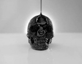
You can see the amount work put into the image when compared with the original


Final Cut was the only film editing program we used. We debated using Adobe after effects but as the school had Final cut on the Mac we  thought it was best to stick with Final Cut. Daniel edited the footage and the only technical problems we faced were the slow rendering speeds, but everyone faced these problems also.

In terms of filming footage, we used a HTC mobile phone and Daniel's HD video camera.


The camera also came with a microphone added at the top which allowed us to receive better audio quality when filming


Due to the fact the camera wasn't one of the school's equipment we were more confident in trying radical things and thinking outside the box. For example to film the higher shots and mimic the crane shot we hooked up the camera to a wooden stick.

You can see this in action here:

It did become strenous to film with the makeshift jib so we only really used it for the scene with Max.


The photos for the album/poster were taken on one day using a HD camera. It took a lot trial and error but we think the shots we took greatly represent the theme of our music video.


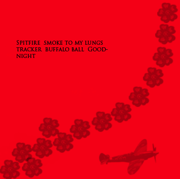
Using Photoshop was extremely difficult at the start but we really got the hang of it as we went on. Me and Max created the CD cover and magazine advert and the whole team is content with the final product. The hardest challenge we faced with photoshop was cloning. We wanted to clone the background of the cd panel so it could appropriately fit the dimensions.


We asked for class feedback and many were not able to tell that the image ontop was edited.
Here are some of images where photoshop was used


Again we were focusing on simplicity and how professional it looked. So we would adjust the saturation, increase shadows and maybe add a touch of blur. We really did not do much more than was needed with Photoshop


In conclusion, we used various mediums and forms of technology to communicate and create a professionally looking project. We had a hectic end to last years media project and said to ourselves we need to keep every thing simple and easy. So this year we focus purely on making the Covers,posters and overall look believable and professional rather than over the top. This could not have been done without the necessary technology.


CLICK HERE TO SEE MY EVALUATION ON WIX.
http://www.wix.com/avantgardemediaprodu/avant-garde#!evaluation-q4


Monday, 2 April 2012

Efosa: Music Video: Post-Production: Evaluation: 2) How effective is the combination of your main product and ancillary texts?

2 - How effective is the combination of your main product and ancillary texts?

In regards to our branding of the music video the whole atmosphere of the video is quite grungy with a scary undertones. But it is not obvious what is actual scary to the audience. The prominent features of the video are the mirror, baseball bat, gas mask and the white contacts that I wear.These four objects have nothing in common with each other and this sense of confusion is carried out throughout the video.

In the video we decided to go with a very simple ident that did not give away too much into the video.  Avant garde productions fading into a background sufficed.


In the digipak we kept the branding consistent by continuing the brush and colour scheme. We got hold of some war-themed brushes that really brought out our identity.


This was one of our first drafts and it evolved into the image below. We felt the grungy, dirtier colours would much better represent the values and attitudes linked with our music video. We felt it looked much more professionally made as well.


The reasoning behind the skull was taken from inspiration of watching Jay Z's On To The Next One. The skull is one of the most symbolic features of the video and we thought it would be quite good to use one of the most popular rap artist's video for one of out intertextuality features. Even though it's not in the same genre as a Prodigy song, the video harbours very similar themes.

Another instance is the shots of the guy with black gothic makeup. Which was modelled after Brandon Lee's "Crow" and Ledger's Joker.


Chloeryane is made to look like the Angel of  Darkness or something similar. In editing we increased the dark colours to really make the gothic, dark nature element of that shot prominent.

The colour red bears the connotations of action, violence and power and these themes are all relevant in the  music video. Action being Chloerayne running through the forest being chased, violence being Max holding a baseball bat with the intent of attacking with it. And Max has power over Chloerayne throughout the whole chase as he is the one chasing her. In addition in the rough cut edit we have so far, we can see that there are some red cuts in it.


The inspiration behind the toxic waste brush at the top was the fact nuclear weapons were a prominent part of WWII, which is a theme of the Spitfire. We added the spitfire on the bottom right because it's the subject of the song and the embroidered flowery pattern going left to right was used to increase the relevance to the setting of the forest. So all the brushes were some how related to the song lyrics or music video.

these 3 brushes appear on all the insets albeit on a smaller scale.


The process of making the CD cover was long drawn and required many sketches and thinking. Our initial ideas were from the images we first took. 

The image above was the very first image we drafted for the CD cover. We did not proceed with it purely because it would have been too unrealistic to recreate. Plus we were not skilled enough in Photoshop to create such effects.


The problem we had with the image was that the mise-en scene was not completely appropriate for the video. The ladder on the right is visible and Chloerayne's Iphone which was used to take the image is in the shot.  Also there was too much empty space behind and it gave too much away in terms of our video setting.
In the end we decide to choose the most visually ambiguous photo because it gave the viewers no clue as to what our video was about.
The lights and the mask are particularly weird to look at because it is complete juxtaposed to Chloerayne's petite and innocent frame.


Inspiration was taken from images such as these:


The tusk(mask) used on the face of pretty girl creates confusion and confusion creates interest. That was our thinking behind the cd cover. To create interest, which we feel we have done successfully.

Friday, 3 February 2012

Max Davies: Music Video: Post-Production: Evaluation 4

4) How did you use new media technologies in the research, planning, construction and evaluation stages?


The use of technology is how we made our project to the best of its ability. We had to fully understand each part of technology, from school equipment and technology to equipment and technology we have bought to help our project succeed.

Overall production we used all types of technology. We used the internet frequently, without it out project would not of been able to start. We used search engines like Google, to gather pictures to create mood boards. We used websites like www.barb.co.uk to find out information about our demographic and what T.V shows are most popular. Along with websites we used magazines and books to find out example music adverts.

The main website used was YouTube, we used this to find our song of choice, find inspiration for our video and find the remix to the song which we use in the second part of the video. We also used social networking websites like Facebook to arrange when we was filming and to communicate within out media group, we also used it to promote our final video and get it around the world.


When creating this project we frequently used software and applications. We used Skype to communicate within and have a group phone call, this was great as we can all discuss outside of school times. The two softwares we used for our project was Photoshop and Final Cut. We used Photoshop to create our digipack and magazine advert and used Final Cut to edit our video and add in effects. Dan also had Final Cut at home so we could edit round his out of school hours. We found difficulties when using these like not understanding layers in Photoshop and taking forever to render on Final Cut.

The final Website used was Blogger. I was constantly blogging, I set it as my homepage on my computer. I tried to do a blog a day, it was a place where we can write about our progression and what has been happening. 

In terms of camera, sound and lighting. Instead of using the school camera we used Daniel's new HD camera, which was a great size and had such a clear image. We also had a brilliant microphone and handle so we could get great swooping shoots and clear sounds. 


We also made some very D.I.Y equipment, we made two cranes out of wood, a scooter, pieces of metal and gaffer tape.


We also used a wheelbarrow to create a dolly effect and make a smooth run from a low angle. The strengths of this is that it was cheap however the quality wasn't the best and they fell apart after a while.


In terms of editing we used Final Cut Express and Adobe Photoshop. We split our group up, Daniel used Final Cut more and Me and Efosa used Photoshop. When I started creating the digipack and advert i had never used Photoshop. We had a few lessons on basic stuff by our IT technician Jack, he help me alot in understanding the software. 


I learnt about brushes and how to use them, I downloaded them from the internet then imported then to Photoshop and use effectively. 

The controls i learnt about the most was how to use layers, these are vital in making the project look good. They have to be in order and kept in control.

I learnt about adjustments like colour contrast and colour balance. This made the pieces look dark and distorted, to link with the video.

We also the tool of cloning, we was able to imitate a bush with cloning a bush and brushing over.


In terms of the digipack and magazine advert we had to make it look as professional as possible. Our friend Luca Green help us by taking photos of us before a day of filming. We meet early and had a photo shoot, he is a very good photographer and used different lenses and used the sun to make our pictures have a great colour.

View evaluation in WIX
http://www.wix.com/maxdavies11/maxdavies-avantgardeproduction


Max Davies: Music Video: Post-Production: Evaluation 3

3) What have you learned from your audience feedback?

Target Audience

For target audience profile, we thought our friend Robin Hirst is the first person we thought of, he is the perfect demographic through our music video. He is 17 year old caucasian boy from Loughton, Essex. A suburb of London, with his mum and brother. He works as a trainee hairdresser in a modern hairdressers and stylist in Camden, London.

He grew up listening to a lot of classic 1980's Rock as it was my parents favourite. So Rock music is always on my iPod, however when he got older, he discovered more Drum n Bass and Electro from parties and raves. So The Prodigy would be something Robin listens to.

Robin likes gigs, fashion, skateboarding, tattoos and piercing. He doesn't like rules and mainstream music.

From researching professional music videos we found some similiar videos to ours. The first is Sigur Ros - Vaka (A.K.A Untitled #1).

Sigur Ros are an Icelandic Post-rock band signed to XL. They are know for their incorporation of classical and minimalist into their music.

This video is about people being trapped by the gas mask in a location with low verisimilitude, it looks like hell. This video is aimed at ambient alternative people as the music is very underground, niche and individual, the complete opposite to main stream music. Our video relates to this as the plot and story is similar. The person in our video is trapped in the gas mask and is 'hunting' a new victim to trap with a gas mask.


The second is the official Spitfire video by The Prodigy. This relates to our video as we the editing is similar and the performance. The editing is similar with use of colours such as red and green. The editing is also quite destructive and distorted, something we used will editing our music video.


When creating the music video we had to consider many different elements so that it would appeal to our demographic or target audience.

The characters in our video are the girl being chased, the man with the gas mask and the band. When viewing we went the audience to identify the girl as a 'heroine' as she is viewed as the good, she is trying to escape and get away from the gas mask man who is viewed as the 'villain.'

Another element built into the production of our music video is social groups, examples are gender, age or ethnicity. In our video we have represented gender as the villain is male and has a powerful advantage over the girl, he is dominant.

Audience Feedback


Once our whole project was finished we conducted some audience feedback sessions. We finished our Digipack and Magazine Advert first, so we gathered the class around our computer and presented our digipack:


Everyone received the pack well, it jumped out to them and caught their eyes. Here are some quotes from our feedback:

"Excellent use of photoshop"
"Powerful Images" 
"The colours are dark, dirty and mysterious"
"Font doesn't look tacky"
"Professional Product"

Next we presented out magazine advert:


again here are some quotes from the feedback:

"Image is perfect in showing the members of the band"
"Branding is excellent"
"Font is prominent"
"Would fit straight into a magazine"

Finally we presented the class with our music video:

Here are some quotes from the feedback:

"Good job boy's"
"Really professional piece of media"
"Would see it on a music channel"


We are very pleased with our final product, it is better than we expected. everything just went together perfectly. From looking at the OCR brief we believe our product meet their requirements to obtain a high grade. For the video we read that the candidate must demonstrate 'a variety of shot sizes.' We think we meet this as we made sure we got as many shots which were all different and 'out side the box.' 

For the Digipack and Magazine Advert it says that the candidate must  have 'awareness of the need for variety in fonts and text size' we know we have meet this from our audience feedback, in our feedback we are told we use a 'good mixture of fonts.'

Once finished we compared our music video to professional products, by watching music channels like 'Kerrang' to look at videos, we also looked through magazines such as 'Q' to look at adverts and album covers. After we felt very positive that our product was something to be proud of an hopefully get a high grade. 

From our feedback we believe our product has the genres essential ingredients. We were told that from the audience that they would 'watch the video again' and 'buy the album them selves.' They thought the artwork was very 'eye catching', this is something which would be jump out from the shelf in a shop.

Our product is aimed at a mass market and would be distributed and promoted by a major record label, such as XL, The Prodigy are signed by XL at the minute a huge label which has global recognition. In our audience research we found that our product would be placed in magazines such as 'Kerrang' and 'NME', these magazines are sold al over the UK and other countries, with artists which are popular and are making hits which are played all over the radio and T.V. Our audience profile would appeal to our video as he will be aimed as the adverts would be in the magazines he read and the video would be in the music channel he watches.

When creating our product we had to have a USP (unique selling point), this is something which stands out and makes somebody interested in our product. When developing ideas the main idea was the gasmask, when we thought of this we instantly knew this would be the main focus of our product. We like this image and thought it would appeal to people because it is very chilling when you see it. It gives the video an inhuman feel effect, this is something that appeals to teenagers of this day and age, wanting to be different and rebellious. They want to know more as it is mysterious, 'what is under the mask?'

As this image is powerful merchandise would be a great opportunity to maximize profits. We would create t-shirts, Jumpers, iPhone cases, key rings and hats, all items which appeal to our demographic. As iPhones and smart phones are something which are common within society now. The gasmask is a perfect image for branding of the band, when people see the image on merchandise they will instantly think about the band.

View evaluation in WIX
http://www.wix.com/maxdavies11/maxdavies-avantgardeproduction


Max Davies: Music Video: Post-Production: Evaluation 2

2) How effective is the combination of your main product and ancillary texts?


"Branding is a name, term, design, symbol or any other feature that identifies someones good or service to a market. The term branding came from telling one person's cattle from another with a hot iron stamp. It is important because it is what makes your product stand out and make the customer want it."

In our video we developed many different elements of branding, to make our video unique and significant.

Our overall brand of it is quite dark, gritty with a nightmare/surreal feeling. We feel our audience appeal to this theme of branding. However there are features of the video which go into branding detail and helps create the image we are after. 

The first being the gas mask:
This is our main branding element of our product, we believe it is a striking image with a lot or presence. This will stick in peoples minds.

The second is the use of the heroine:
The use of a girl, helps the brand move to different markets, with an attractive character who teenage girls will look up to.

The third is the mirror:
This is something which pushes the unusual image, something not normal. The mirror is the certain of all of the destruction. 

Also we used an ident at the beginning of the video, we kept it simple with a creepy effect. This brands our company as it will be shown before every production.


In our digipack I feel our branding is very strong through out, with good colour scheme and pictures which will strengthens brand image.


To create a brand their are many elements within our digipack. 

The use of brushes:
We had to look through brushes on the internet, which are ready  made images that we can 'brush' on to photoshop images. Brushes are used in professional digipacks to make it look more professional, it is simliar to established forms and conventions.

The image choices:
We had a photo shoot to get images for the digipack. Doing this has increased our professional value, the photos came out so well and look so professional. We started at sketches and pictures from phones, but doing a shoot has made our images look much more appealing, professional photos are a convention of an album cover

Band logo:
I did some research into other artists digipack's and how the brand themselves, i found it is a convention in some genres. I found that the use of a logo is a good way of creating brand image. I then search for gas mask images to use for a logo. We will use this logo on all products like, merchandise and magazine advert.

Use of mirror:
We used the image of the mirror in the digipack to emphasis its meaning. The more you see it, the more familiar it becomes and it will be connected to The Prodigy's image.

Colour: 
The colours we wanted to use was dark and gritty, so that it links with the video. We thought dark reds and greens. Good colour scheme is a convention of digipack, the colours are always linked and look good together.

Text:
I think in an artists digipack font is the most important feature to make the product have a brand which will stick. I wanted a font which will link perfectly to the bands image, I searched over the internet to find fonts which will go. I narrowed it down to three, but i pick this one after all.

In terms of influences when creating the digipack, we did a lot of research into covers from artists in the same genre.

The fornt cover was influence by two images. The first is a image of a girl in WW2 wearing a gasmask:

We liked this as it showed the girls innocence and contrasts from the mask.

The second is from the game, we photoshopped her eyes with glowing lights.

In our Magazine advert, i think it is the most professional piece. I think the branding comes through strongly and can sit comfortably in a magazine.


Mirror/image:

In the advert we used the mirror again to link to the digipack and video. It strengthens the mirrors meaning and presence. The image is quite powerful with the band being in the reflection of the band looking significant as the shot is from a low angle. An image of the band is something which is in neary every mass market bands advert, seen as a convention.

Font:

The font we used in the advert is the same as the digipack, this follows the bands image and starts to make the customers recognise the band and their brand. The magazine ratings are in a bold font so that it stands out, however the font is slightly broken up, this links to the bands distorted and rebellious image.

Logo:

We used the logo of the gasmask, which is the logo of the band. Logos are used in professional adverts and is seen as a convention.

                                                    
Colour:

The colour in the advert is quite red and dark, these are colours which are used in the video and digipack.

Ratings:

Ratings are a form and convention of a magazine advert, it is to show the reader how the album is rated by magazines which are respected and a good judgement. 

In terms of influences we did a lot of looking through magazines and searching the internet. We took inspiration for the ratings and the small print. We was looking through our photos and saw this one, we instantly knew this would be our advert. 

Here is our  progression of our magazine:


View evaluation in WIX
http://www.wix.com/maxdavies11/maxdavies-avantgardeproduction