2 - How effective is the combination of your main product and ancillary texts?
In regards to our branding of the music video the whole atmosphere of the video is quite grungy with a scary undertones. But it is not obvious what is actual scary to the audience. The prominent features of the video are the mirror, baseball bat, gas mask and the white contacts that I wear.These four objects have nothing in common with each other and this sense of confusion is carried out throughout the video.
In the video we decided to go with a very simple ident that did not give away too much into the video. Avant garde productions fading into a background sufficed.

In the digipak we kept the branding consistent by continuing the brush and colour scheme. We got hold of some war-themed brushes that really brought out our identity.
This was one of our first drafts and it evolved into the image below. We felt the grungy, dirtier colours would much better represent the values and attitudes linked with our music video. We felt it looked much more professionally made as well.

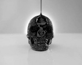
The reasoning behind the skull was taken from inspiration of watching Jay Z's On To The Next One. The skull is one of the most symbolic features of the video and we thought it would be quite good to use one of the most popular rap artist's video for one of out intertextuality features. Even though it's not in the same genre as a Prodigy song, the video harbours very similar themes.
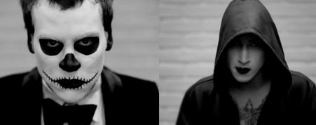
Another instance is the shots of the guy with black gothic makeup. Which was modelled after Brandon Lee's "Crow" and Ledger's Joker.

Chloeryane is made to look like the Angel of Darkness or something similar. In editing we increased the dark colours to really make the gothic, dark nature element of that shot prominent.
The colour red bears the connotations of action, violence and power and these themes are all relevant in the music video. Action being Chloerayne running through the forest being chased, violence being Max holding a baseball bat with the intent of attacking with it. And Max has power over Chloerayne throughout the whole chase as he is the one chasing her. In addition in the rough cut edit we have so far, we can see that there are some red cuts in it.

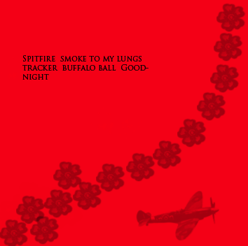
The inspiration behind the toxic waste brush at the top was the fact nuclear weapons were a prominent part of WWII, which is a theme of the Spitfire. We added the spitfire on the bottom right because it's the subject of the song and the embroidered flowery pattern going left to right was used to increase the relevance to the setting of the forest. So all the brushes were some how related to the song lyrics or music video.
these 3 brushes appear on all the insets albeit on a smaller scale.

The process of making the CD cover was long drawn and required many sketches and thinking. Our initial ideas were from the images we first took.


The image above was the very first image we drafted for the CD cover. We did not proceed with it purely because it would have been too unrealistic to recreate. Plus we were not skilled enough in Photoshop to create such effects.

The problem we had with the image was that the mise-en scene was not completely appropriate for the video. The ladder on the right is visible and Chloerayne's Iphone which was used to take the image is in the shot. Also there was too much empty space behind and it gave too much away in terms of our video setting.
In the end we decide to choose the most visually ambiguous photo because it gave the viewers no clue as to what our video was about.
The lights and the mask are particularly weird to look at because it is complete juxtaposed to Chloerayne's petite and innocent frame.

Inspiration was taken from images such as these:

The tusk(mask) used on the face of pretty girl creates confusion and confusion creates interest. That was our thinking behind the cd cover. To create interest, which we feel we have done successfully.
No comments:
Post a Comment